


[BR] Accounting Reporting Widgets
Overview
The Accounting Reporting Widgets include:
Report | Type | Data Source |
|---|---|---|
Accessorials Report | Data Table | Zuum Admin |
Carrier Payables | Pie Chart | Zuum Admin |
Income Report | Bar Chart | Zuum Admin, Quickbooks |
Expense Report | Bar Chart | Zuum Admin, Quickbooks |
Income Statement | Data Table | Zuum Admin, Quickbooks |
Burn Rate | Data Table | Quickbooks |
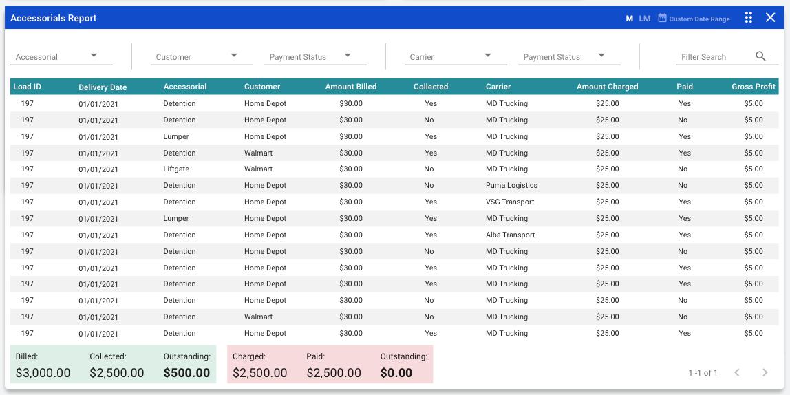
1. Accessorials Report
The Accessorials Report displays a list of each accessorial that has been used, so that the brokerage can analyze this revenue stream.
Widget Info:
Widget Size: 4 x 2
Widget Title: “Accessorials Report”
Note that all data is based accessorial activities that occurred during the selected time interval
Table Data:
Columns:
Load ID
Delivery Date
Accessorial
Customer
Amount Billed
Collected
Carrier
Amount Charged
Paid
Gross Profit
Number of rows: 15
The table has pagination
Filters:
This widget has 6 filters at the top, that afford the user with the ability to better analyze the data.
The filters are:
Accessorial
A dropdown with all of the accessorial types in the database.
The options should have checkboxes next to them so that the user can select more than one at a time
The user should be able to type into the dropdown/text field in order to find the desired option quickly
The user MUST select one of the options for the filter to take effect
Customer
A dropdown with all of the customers in the database
The options should have checkboxes next to them so that the user can select more than one at a time
The user should be able to type into the dropdown/text field in order to find the desired option quickly
The user MUST select one of the options for the filter to take effect
Payment Status (this is based on whether payment HAS BEEN COLLECTED from the customer)
Collected
When selected, the table should only display records where the “Collected” field is set to “Yes”
Not Collected
When selected, the table should only display records where the “Collected” field is set to “No”
Carrier
A dropdown with all of the carriers in the database
The options should have checkboxes next to them so that the user can select more than one at a time
The user should be able to type into the dropdown/text field in order to find the desired option quickly
The user MUST select one of the options for the filter to take effect
Payment Status (this is based on whether payment HAS BEEN MADE to the carrier)
Paid
When selected, the table should only display records where the “Paid” field is set to “Yes”
Not Yet Paid
When selected, the table should only display records where the “Paid” field is set to “No”
Filter Search
A text input search that searches the data table
Totals Data:
Below the table there are two boxes displaying Totals.
The first box displays the totals for Accessorial income
Billed (the amount that Zuum billed customers for accessorials)
Collected
Outstanding (Billed - Collected)
The second box displays the totals for Accessorial expenses
Charged (the amount that carriers charged Zuum for accessorials)
Paid
Outstanding (Charged - Paid)
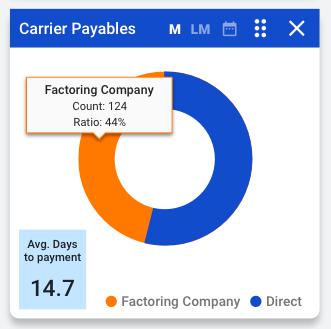
2. Carrier Payables
The Carrier Payables report is a pie chart that breaks down which carriers are paid directly vs. via a factoring company.
It also includes the average amount of time (in days) that it takes Zuum to pay its carriers.
Widget Info:
Widget Size: 1 x 1
Widget Title: “Carrier Payables”
Chart Info:
Pie Chart with 2 variables
Direct
The number of carriers that have been paid directly during the selected time interval
Factoring Company
The number of carriers that have been paid via a factoring company during the selected time interval
Tooltip
On hover, the tooltip displays the following data
Variable type (direct vs. Factoring)
Count - the number of carriers that meet that variable
Ratio - the percentage of carriers in that category
Other Data:
Below the chart there is a small box that displays the average time (in days) that it took Zuum to pay all carriers during the selected time interval.
3. Income Report
The Income Report widget displays the company’s total income, broken down by income sources in a bar chart.

Widget Info:
Widget Size: 2 x 1
Widget Title: “Income Report”
Chart Data:
Type: Bar Chart
y-axis (left): Amount ($)
x-axis: Income Source
Chart Variables:
Ops
Broker (SaaS)
Carrier (SaaS)
Shipper (SaaS)
Platform (PaaS)
Tooltip:
When the user hovers over a variable in the chart, a tooltip should appear and display the data for that variable. The data should include:
The date range for that point
The total (sum) of the income for that variable
Other Data:
The widget should display the total sum of all income for the selected time interval.
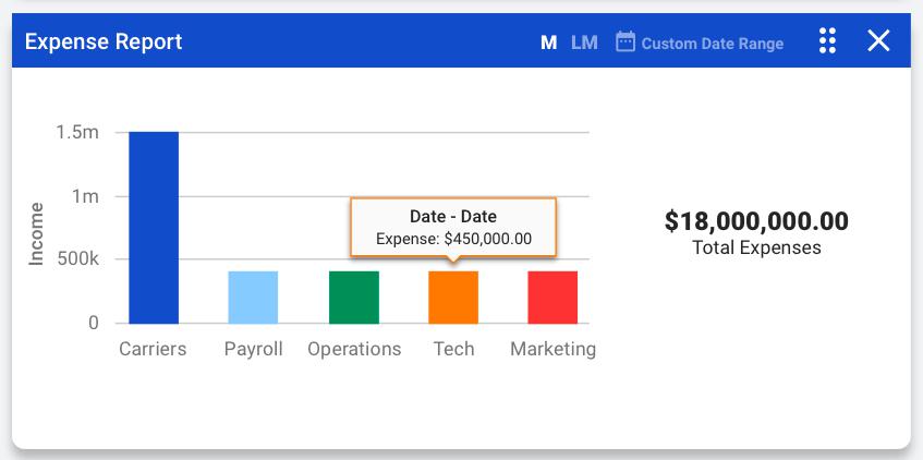
4. Expense Report
The Expense Report widget displays the company’s total expenses, broken down by expense groups in a bar chart.
Widget Info:
Widget Size: 2 x 1
Widget Title: “Expense Report”
Chart Data:
Type: Bar Chart
y-axis (left): Amount ($)
x-axis: Expense Group
Chart Variables:
Carriers (Cost of Goods Sold - COGS)
Payroll
Operations
Tech
Marketing
Tooltip:
When the user hovers over a variable in the chart, a tooltip should appear and display the data for that variable. The data should include:
The date range for that point
The total (sum) of the expense for that variable
Other Data:
The widget should display the total sum of all expenses for the selected time interval.
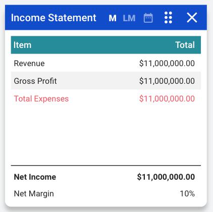
5. Income Statement
The Income Statement widget displays the company’s financial data, taking into account total expenses (not just COGS).
Widget Info:
Widget Size: 1 x 1
Widget Title: “Income Report”
Table Data:
Columns:
Item
Revenue
Gross Profit
Total Expenses
Net Income
Net Margin (Net income / revenue) (%)
Total
The amount for each line item
Data Source:
Zuum Admin for Income from freight
Quickbooks for
Expenses
Other income sources (if applicable)
6. Burn Rate
The Burn Rate widget is a data table that displays the company’s “Burn Rate,” or rate at which it spends money, especially venture capital, in excess of income.
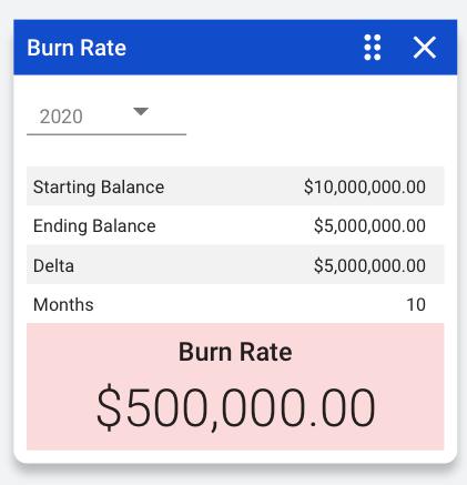
Widget Info:
Widget Size: 1 x 1
Widget Title: “Burn Rate”
Table Data:
Rows:
Starting Balance and total
Ending Balance and total
Delta (Starting - Ending balance) and total
Months and total (the number of months within the selected time interval)
Burn Rate = Delta / Months
Time Interval Selector
The time interval selector is a dropdown that allows the user to select the fiscal year.
This should be set to the current year by default