


Executive Reports
UI spec on Invision - In general, use Highcharts for graphs.
Report Title | Report Type | Y-Axis | X-axis | Data Source |
|---|---|---|---|---|
Burn Analysis | Data Table | Categories
| Value of each category for each month, over the last four months | The data for these categories needs to be imported from quickbooks. In Quickbooks, this data is categorized according to this spreadsheet: https://docs.google.com/spreadsheets/d/1JFRTKqgUu045-VzxvEKWzousgtNu915L/edit#gid=1375459315 There are three columns in the spreadsheet.
This data should be pulled according to the time interval selected. Starting/Ending Cash 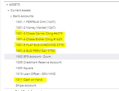 Starting Cash is the Cash on the first day of the interval period; Ending Cash is the Cash on the last day of the interval period; |
Cash on Hand & Total Burn | Column and Line (https://www.highcharts.com/demo/combo) | Money (“Cash on hand”) The columns represent the Cash on hand at the end of each period (“Ending Cash” from burn analysis report). The line represents the total burn at the end of each period (“Total Burn” from burn analysis report) | Time | Quickbooks/burn analysis report |
Total Burn vs Net Burn | Column with negative values (https://www.highcharts.com/demo/column-negative) | Money Gray column = represents total burn Blue column = represents net burn (see burn analysis report for values) | Time | Quickbooks/burn analysis report |
Gross Margin vs. Operating Income | Column with negative values (https://www.highcharts.com/demo/column-negative) | Money Light Blue column = Gross Margin Dark blue column = Operating Income | Time | Quickbooks |
Customer Income by % of Revenue | Bar Chart with Percent Labels (https://www.highcharts.com/demo/bar-basic) | Customer Name % = sum of money earned by that customer over the time interval selected / the total money earned over that time interval All customers that have a % of less than 1.5, should be grouped into a single category called “SMB” | Money = the sum of money earned by that customer over the time interval selected | Zuum Admin income data |
Carriers Performing Repeat Business Over Time | Basic Column (https://www.highcharts.com/demo/column-basic) | Number of carriers This is the number of carriers that were tendered a load by Zuum more than 1 time during each unit of time (month/quarter/year) | Time For this chart, the time interval that the user can select should be limited to:
Show a maximum of 12 intervals, ending with the current month/quarter/year If intervals < 12, show the total number of intervals | Zuum |
Percent of Carriers Performing Repeat Business Over Time | Basic Column (https://www.highcharts.com/demo/column-basic) | Percent of carriers This is the number of carriers that were tendered a load by Zuum more than 1 time during each unit of time (month/quarter/year) / the total number of carriers that were tendered a load by zuum during the same unit of time | Time For this chart, the time interval that the user can select should be limited to:
Show a maximum of 12 intervals, ending with the current month/quarter/year If intervals < 12, show the total number of intervals | Zuum |
Customers Performing Repeat Business Over Time | Basic Column (https://www.highcharts.com/demo/column-basic) | Number of customers This is the number of customers that sent a shipment with Zuum more than 1 time during each unit of time (month/quarter/year) | Time For this chart, the time interval that the user can select should be limited to:
Show a maximum of 12 intervals, ending with the current month/quarter/year If intervals < 12, show the total number of intervals | Zuum |
Percent of Customers Performing Repeat Business Over Time | Basic Column (https://www.highcharts.com/demo/column-basic) | Percent of carriers This is the number of customers that sent a shipment with Zuum more than 1 time during each unit of time (month/quarter/year) / the total number of shipments that were sent by all customers through zuum during the same unit of time | Time For this chart, the time interval that the user can select should be limited to:
Show a maximum of 12 intervals, ending with the current month/quarter/year If intervals < 12, show the total number of intervals | Zuum |
Quarterly Top Line Income vs Projected Annual Run Rate | Basic Column (https://www.highcharts.com/demo/column-basic) | Money Income = Total Revenue (see burn analysis report) Run Rate = Income x 4 + (avg growth MoM growth over last quarter) | Time (by quarters, show last 8) | Quickbooks |
Customer Growth | Depending on Toggle:
| Time The user can define a time range. Default settings - the time range begins two months prior to the current month, and extends 12 months from the start date The start date must be the current date or earlier | Zuum Admin Data Note - this chart is interactive. See below for the requirements. | |
Projected Growth of Carriers Performing Repeat Business | Basic Column (https://www.highcharts.com/demo/column-basic) If possible, have a different color column for historical data and for projection data | Number of carriers This is the number of carriers that were tendered a load by Zuum more than 1 time during each quarter | Quarters Display last 4 quarters; and Future 8 quarters | Zuum Admin Data This widget includes an input for a projected growth factor, which is represented as a percentage. The default value is 3.5% The future projections are calculated by taking the most recent quarter, and applying the Growth Factor to that and each subsequent quarter. |
Projected Growth of Customers Performing Repeat Business | Basic Column (https://www.highcharts.com/demo/column-basic) If possible, have a different color column for historical data and for projection data | Number of customers This is the number of customers that sent a shipment with Zuum more than 1 time during each quarter | Quarters Display last 4 quarters; and Future 8 quarters | Zuum Admin Data This widget includes an input for a projected growth factor, which is represented as a percentage. The default value is 3.5% The future projections are calculated by taking the most recent quarter, and applying the Growth Factor to that and each subsequent quarter. |
Revenue Growth and Projections | Stacked Column | Revenue (money) This axis includes the total income from two sources: 1. Marketplace 2. SaaS | Calendar Year Range 2016 - 2025 | Quickbooks These revenue groups can be found in this spreadsheet: https://docs.google.com/spreadsheets/d/1JFRTKqgUu045-VzxvEKWzousgtNu915L/edit#gid=1375459315 This widget includes two inputs for a projected growth factor, one for each revenue source (Marketplace, SaaS), represented as a percentage. The default value is 3.5% The future projections are calculated by taking the most recent year, and applying the Growth Factor to each subsequent quarter. |
Margin Growth and Projections | Stacked Column | Margin (Gross Profit) (money) This axis includes the margin from two sources: 1. Marketplace 2. SaaS | Calendar Year Range 2016 - 2025 | Same as above, only instead of revenue, this report shows Margin (Gross Profit) |
Headcount Growth and Projections | Basic Column (https://www.highcharts.com/demo/column-basic) If possible, have a different color column for historical data and for projection data | Number of employees | Quarters Display last 4 quarters; and Future 8 quarters | Q1 2020 = 46 Q2 2020 = 61 Q3 2020 = 67 Q4 2020 = 75 This widget includes an input for a projected growth factor, which is represented as a percentage. The default value is 17.5% The future projections are calculated by taking the most recent quarter, and applying the Growth Factor to that and each subsequent quarter. |
Summarized Pro Forma | Table | Categories
| Value of each category for each calendar year, from 2021 to 2025 For initial default settings, please see below in the “Summarized Pro Forma” report requirements, under the “Outlook Toggle” section. | Internal. This widget can be configured. The initial values for year 2021 should be pre-set as described below. Please see below for requirements for how to configure and interact with this widget. |
Interactive Reports
Summarized Pro Forma
This widget has the following interactive elements, in addition to the data table:
Outlook Toggle
Preset Name (dropdown)
Growth Factor Configuration
Outlook Toggle
The outlook toggle has three options
Conservative
Moderate
Aggressive
This toggle allows the user to choose between three different growth projections.
The initial values should be set as follows for each toggle:
Conservative John Cochran John Cochran
2021 | 2022 | 2023 | 2024 | 2025 | |
|---|---|---|---|---|---|
Marketplace | $ | % | % | % | % |
SaaS | $ | % | % | % | % |
Margin | % | % | % | % | % |
Total Expenses | $ | % | % | % | % |
Moderate
2021 | 2022 | 2023 | 2024 | 2025 | |
|---|---|---|---|---|---|
Marketplace | $ | % | |||
SaaS | $ | % | |||
COGS | $ | % | |||
Total Expenses | $ | % |
Aggressive
2021 | 2022 | 2023 | 2024 | 2025 | |
|---|---|---|---|---|---|
Marketplace | $ | % | |||
SaaS | $ | % | |||
COGS | $ | % | |||
Total Expenses | $ | % |
Preset Name
This dropdown allows the user to select from a list of presets. Each preset is a configuration of the initial values for the first year and growth projections for subsequent years.
One preset allows the user to configure values for each of the outlook options (conservative, moderate, etc.)
The default preset is called “Default Preset”
The user can create new presets in the Growth Factor Configuration menu.
Growth Factor Configuration
The growth factor configuration menu allows the user to configure the values in the pro forma, and to create or modify presets.
Accessing the Growth Factor Configuration menu:
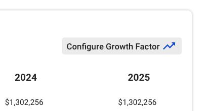
The Pro Forma widget has a button called “Configure Growth Factor”
When the user hovers over this button, there is a background fill
When the user clicks on the button, there is a modal that pops up with the Growth Factor Configuration menu:
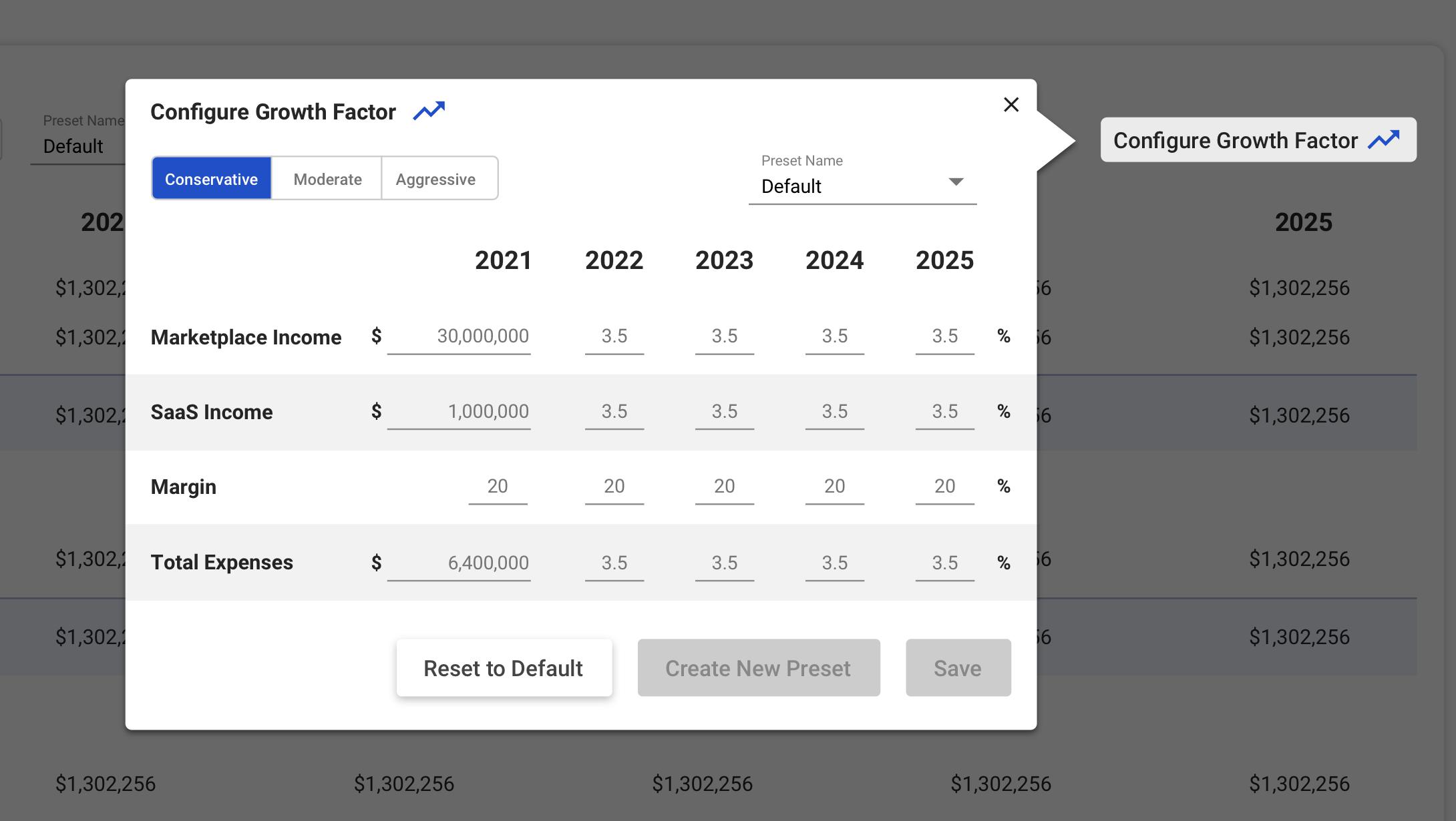
This menu has the following elements:
Outlook Toggle
Preset Name
Here, the user can select which preset they wish to view
This should pre-load to the preset that is currently selected in the widget
Categories
Initial Values for the first year (USD Currency)
Growth percentage values for subsequent years
Buttons
Save (initially disabled)
Create New Preset (initially disabled)
Reset to Defaults
When clicked, all values are reset to default
Close button on the top right to exit the modal
If the user changes a value, the “Save” and “Create New Preset” buttons should become enabled.
If the user clicks Save, then the updated values should be saved to the selected preset
If the user clicks “Create New Preset”, then a new modal should pop up over a transparent dark layer that allows the user to name the new preset:
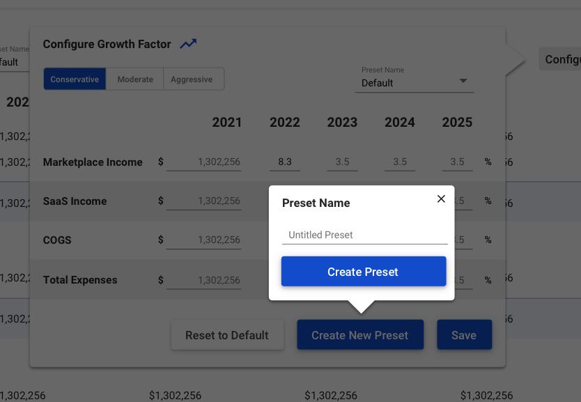
If the user clicks “Create Preset”,
the values should be saved to the newly created preset;
The user is taken back to the widget, with the new preset selected
The data in the widget should update according to the selected preset
Important: Each preset includes data for all three Outlook toggles
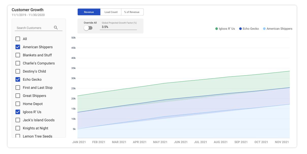
Customer Growth
This widget has the following elements in addition to the chart:
Customer Filter
Y-Axis Toggle
Growth Factor - Set by customer
Growth Factor - Master Override
Customer Filter
The customer filter allows the user to browse or search for a customer, and to select one or more customers for the purpose of viewing the historical and/or growth data.
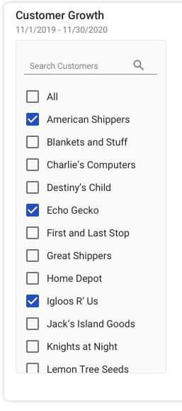
The customer filter is a list of all of Zuum’s customers, arranged alphabetically from A-Z.
Customer Selection
At the top of the list, there is an “All” option. When selected, the aggregate total data from all customers is displayed on the chart.
When one or more customers are selected, the individual customer’s data is displayed on the chart as its own line.
Example: This is how the chart looks when 3 customers are selected:
Customer Search
At the top of the filter, there is an input where the user can enter text to search for a specific customer. The list should filter as the user types.
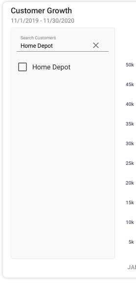
When the user starts typing, the magnifying glass icon should turn into an “x”, which resets the input box and brings back all results.
Setting Customer Growth Factor
When the user hovers over a customer in the customer filter, there should be a background fill, and a “growth” icon.

When the user clicks on the “growth icon” it changes color to blue, and pops up a modal that allows the user to configure the growth factor for “revenue” and “load count” by entering a number that represents the percent that it is projected to grow each month.
The “%” symbol should be fixed so the user only has to input a number. The default number should be set to 3.5%.
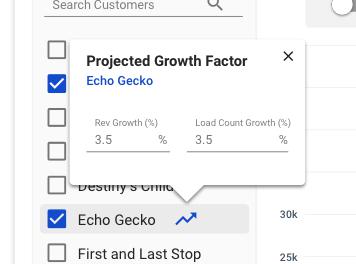
If the user enters a new number, then closes the modal, the blue “Growth Factor” arrow remains visible next to the customer’s name, and the chart updates accordingly.
Individual growth factors can be set to as many customers as desired.
The most recent month of data should be used as a starting point for the growth factor projections.
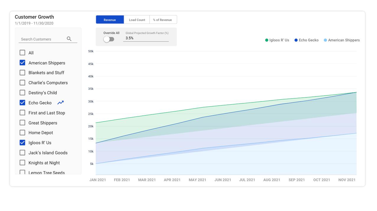
Set Global Growth Factor
The user can easily override all user-defined customer growth factors with the “override all” toggle at the top of the chart.
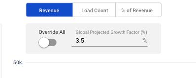
When the switch is turned on, the background of the toggle should turn blue to indicate that it is active.
Functionally, the percentage entered into this toggle should apply to all customers, regardless of the Growth Factor that was individually set to each customer.
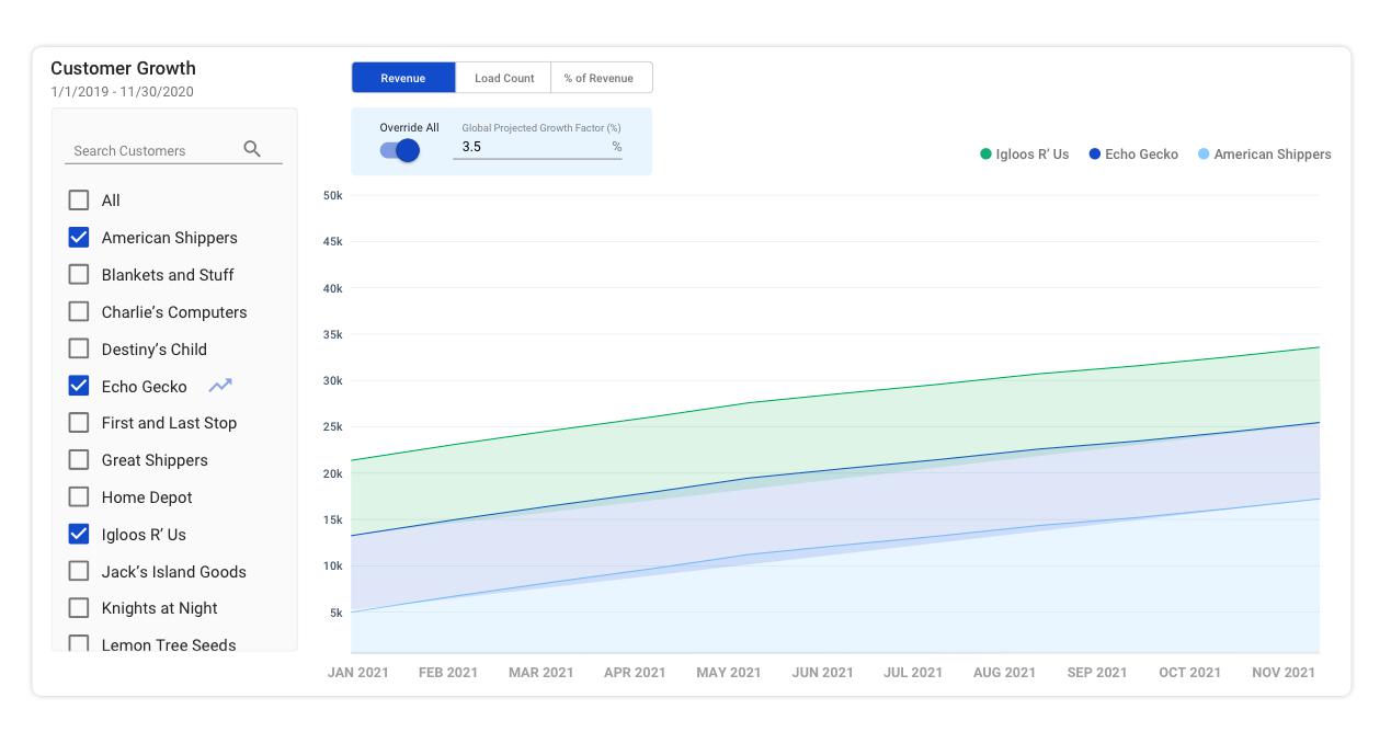
As you can see, the blue “growth” icon next to the customer “Echo Gecko” is still there, but is now faded to indicate that
A growth factor has been set to that customer; but
the global override is turned on, and is therefore displaying the global growth factor instead of the individually set growth factor.
Y-Axis Toggle

The Y-Axis toggle allows the user to toggle between three different sets of data:
Revenue = total income from customer;
Load Count = total number of loads shipped by customer;
% Revenue = total income from customer / total income from all customers
The option that is selected should be highlighted in blue.