Operations Reports

Report Title

Report Type

Y-Axis

X-Axis

Data Source

GPS Tracking Report

This reports tells the operations managers how many loads are being tracked by GPS, and of those, which GPS systems are being used.

This report breaks down the data by operator.

Pie Chart + Table

For table:
See Design in prototype

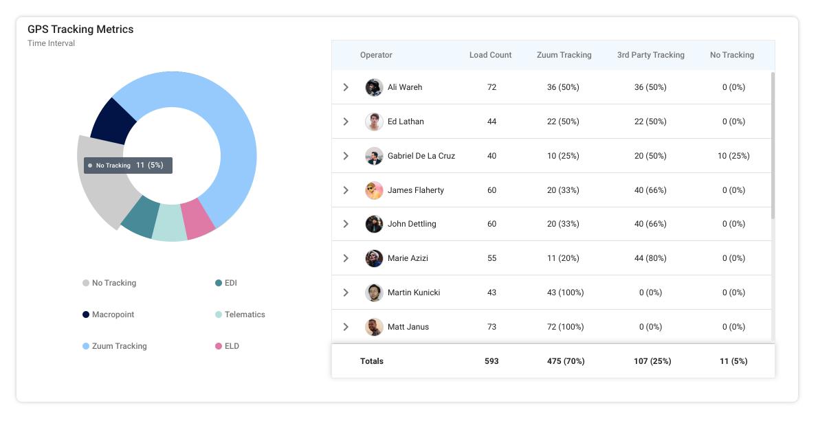
Time Interval is defined by the user

Pie Chart Parameters:

  • Tracking Type

    • No tracking

    • Macropoint

    • Zuum

    • EDI

    • Telematics

    • ELD

Table Columns:

  • Operator (use picture from zuumanity)

  • Load Count (the number of loads that were assigned to this operator)

  • Zuum Tracking (the number of loads assigned to that operator where the driver was tracked with Zuum’s GPS)

  • 3rd Party Tracking (# loads where driver tracked with a GPS system that’s not zuum

  • No Tracking (# loads where there was no tracking)

  • The tracking columns have a percent next to the number which = the number of loads using that GPS for that operator/all loads for that operator

Each row is expandable. When the user expands an operator’s row, there is a breakdown of which GPS type was used.

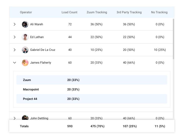
For each GPS type, there is a number which shows the number of loads that used that GPS type, along with a percent of the GPS type / total loads using GPS

Zuum Admin Data

User avatars = Zummanity

Carrier Lookup

This widget helps operators find an optimal carrier for a load.

Table

See design in Prototype

Table:

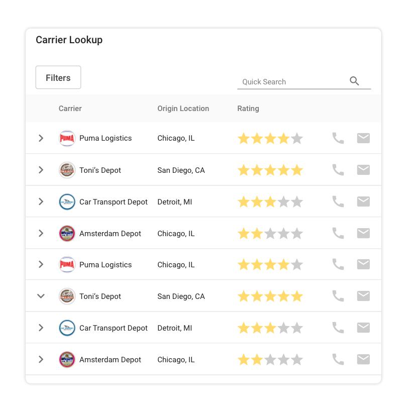
The table is a list of carriers, which includes the following columns:

  • Carrier Name

  • Origin Location (this is where the carrier bases their operations)

  • Rating (this is the rating this carrier has received from Zuum operators)

  • Call Button (initiates a phone call with that carrier’s phone number, as defined in their profile)

  • Email Button (opens the user’s default email client and composes an email to that carrier’s contact email, as defined in their profile)

Each row is expandable. When expanded, the table displays a list of the lanes that the carrier has done for Zuum. (A lane is route -a pickup city and dropoff city).

This table includes the following columns:

  • Mode (this is the truck type(s) that were used for that lane)

  • Rate/Mile (the average rate that the carrier charged/the number of miles in the lane)

  • Volume (the number of times that the carrier has driven that lane for Zuum).

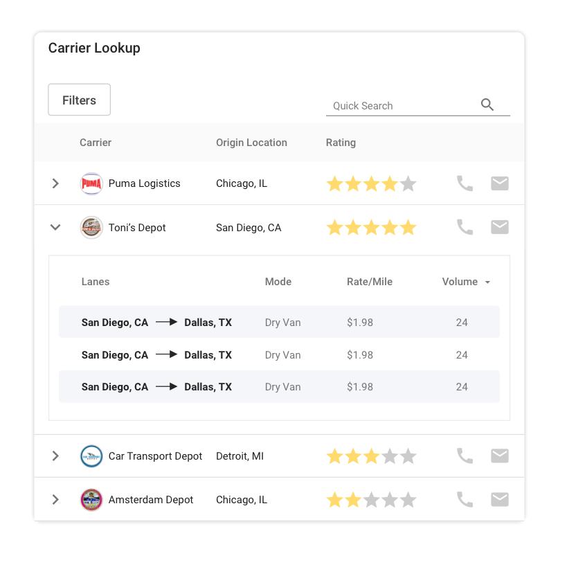
At the top right of the widget is a “Quick Search” text input.

This allows the user to perform a filter search to quickly find a carrier by name or origin location.

Filters:

The table has filters that help the user find an appropriate carrier.

When the user clicks on the filters button, the filter menu appears:

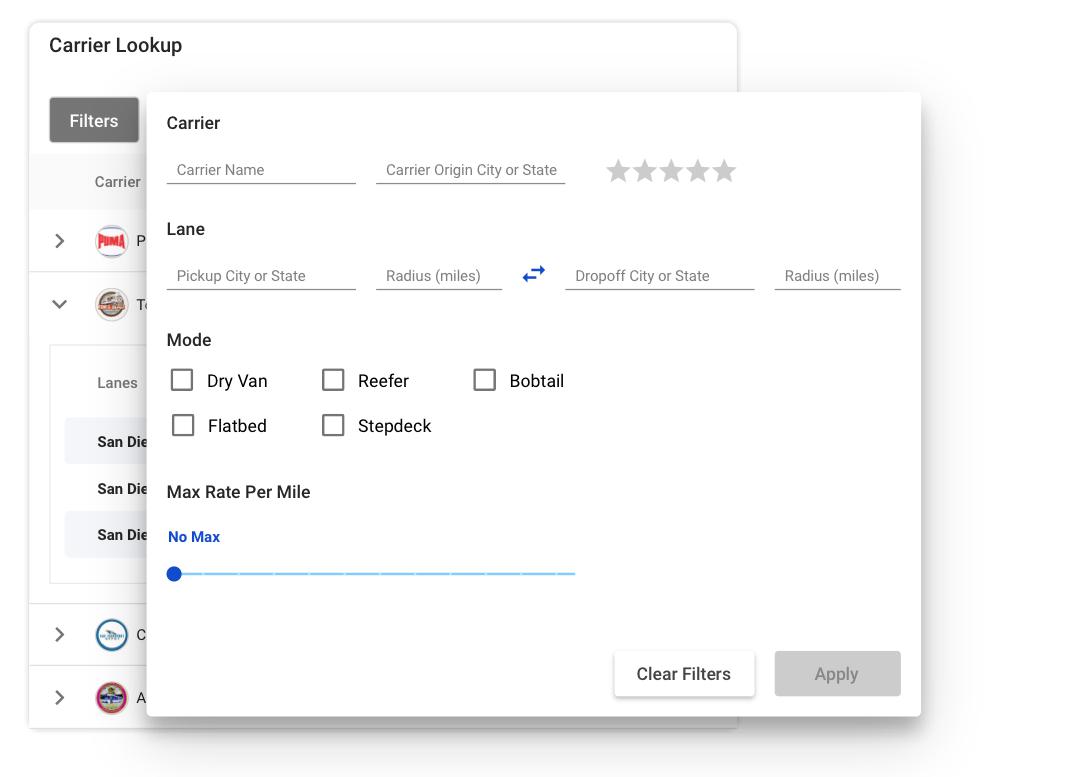
This menu has the following sections and subsections:

  • Carrier

    • Carrier Name

    • Carrier origin city or state

    • Rating (0-5)

  • Lane

    • Pickup City or State

    • Pickup City Radius (miles)

    • Dropoff City or State

    • Dropoff City Radius (miles)

    • Swap Button (this is the arrow between the pickup and dropoff options. If clicked, it swaps what was input for the pickup and dropoff options)

  • Mode (checkboxes) (Each item includes all of the sub-items as listed below.

    • Dry Van

    • Flatbed

    • Reefer

    • Stepdeck

    • Bobcat

    • Power Only

  • Max Rate Per Mile (slider)

    • Allows the user to define a maximum rate per mile. The max should be set to $10.00

“Clear Filters” button - Resets all of the filters

“Apply” button - Applies all of the filters to the Table, and displays only carriers who’s information or lane history is consistent with the search filters.

After filters are applied, the applied filters show up as blue rectangles underneath the “Filters” button on the main view of the Widget, pushing down the data table.

The blue rectangles can be removed by the user by pressing the “X” button, which will also have the effect of resetting that filter.
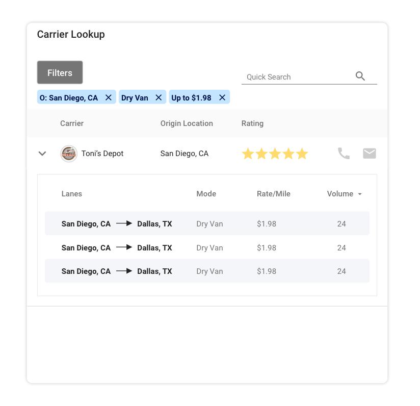
Zuum Admin Data

Covered Loads

Shows the user how many loads have been covered and pre-covered through a time period

Design

Pie Chart

Pie Chart Parameters:

  • Pre-covered

    • The number of loads that were pre-covered during the time period

  • Covered

    • The number of loads that were covered

  • Pending

    • The number of loads that have not been covered

Zuumanity

Outstanding PODs

Shows the user how many PODs have been collected out of the total number of PODs that could have been collected during the time period.

Design

Pie Chart

Pie Chart Parameters:

  • Collected

    • The number of loads where the “Carrier Status” was changed to “Delivered POD Approved” during the selected time interval

  • Outstanding

    • The number of loads where the “Carrier Status” was set to:

      • Delivered;

      • Delivered POD Missing;

      • Delivered POD Requested; or

      • Delivered POD Received

    • AND NOT “Delivered POD Approved”

    • During the selected time period

Zuum Shipment Statuses

Pricing Performance

Shows the user how the operations team is pricing loads based on how far they deviate from the target price of each load

Bullet Graph

https://www.highcharts.com/demo/bullet-graph

Graph 1 - Carrier Pricing

Y-Axis = The team average from the “Bullseye” on carrier pricing

Explanation:

When an operator is in charge of a load, the operator needs to find a carrier that will deliver the load.

The operator pays the carrier to do this. For each load, there is a target rate that the operator should pay the carrier, or less.

If the target price is $100, but the operator can only find a carrier that will do it for $120, then

Best/Worst Lanes Report

The Best and Worst Lanes widgets display a list of the top 8 best and worst lanes. These widgets are almost the same, except the “Best” lanes widget displays the most profitable lanes, while the “Worst” lanes widget shows the least profitable lanes.

Design

Table

Table Data:

Columns:

  • Pickup (City, State) → Dropoff (City, State)

  • Mode

  • Rate/Mile

  • Vol (the number of times that lane has been used)

  • Avg. GP (Gross profit / volume for that lane)

  • Revenue for that lane

Sorting

Best Lanes - This should display the 5 lanes that have the highest “Avg. GP” during the Time Interval

Worst Lanes - This should display the bottom 5 lanes that have the lowest “Avg. GP” during the Time Interval (can be negative)

Zuum Admin Data